Book Excerpt: Working with the DataList Control
In this chapter, we will cover the ASP.NET DataList control. We will learn about
the following:
|

|
This chapter excerpt from
ASP.NET Data Presentation Controls Essentials by Joydip Kanjilal,
is printed with permission from Packt Publishing,
Copyright 2007.
Displaying Data
The DataList control contains a template that is used to display the data items
within the control. Since there are no data columns associated with this
control, you use templates to display data. Every column in a DataList control
is rendered as a <span> element.
A DataList control is useless without templates. Let us now lern what templates
are, the types of templates, and how to work with them. A template is a
combination of HTML elements, controls, and embedded server controls, and can
be used to customize and manipulate the layout of a control. A template
comprises HTML tags and controls that can be used to customize the look and
feel of controls like Repeater, DataGrid, or DataList. There are seven
templates and seven styles in all. You can use templates for the DataList
control in the same way you did when using the Repeater control. The following
is the list of templates and their associated styles in the DataList control.
|
The Templates are as follows:
1. ItemTemplate
2. AlternatingItemTemplate
3. EditItemTemplate
4. FooterTemplate
5. HeaderTemplate
6. SelectedItemTemplate
7. SeparatorTemplate
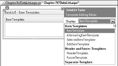
The following screenshot illustrates the different templates of this control.

As you can see from this fi gure, the templates are grouped under three broad
categories. These are:
1. Item Templates
1. Header and Footer Templates
2. Separator Template
Note that out of the templates given above, the ItemTemplate is the one and only
mandatory template that you have to use when working with a DataList control.
Here is a sample of how your DataList control's templates are arranged:
<asp:DataList id="dlEmployee" runat="server">
<HeaderTemplate>
...
</HeaderTemplate>
<ItemTemplate>
...
</ItemTemplate>
<AlternatingItemTemplate>
...
< /AlternatingItemTemplate>
<FooterTemplate>
...
</FooterTemplate>
</asp:DataList>
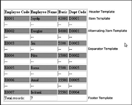
The following screenshot displays a DataList control populated with data and
with its templates indicated.

Customizing a DataList control at run time
You can customize the DataList control at run time using the ListItemType
property in the ItemCreated event of this control as follows:
private void DataList1_ItemCreated(object sender,
...........System.Web.UI.WebControls.
{
switch (e.Item.ItemType)
{
case System.Web.UI.WebControls.ListItemType.Item :
e.Item.BackColor = Color.Red;
break;
case System.Web.UI.WebControls.ListItemType. AlternatingItem :
e.Item.BackColor = Color.Blue;
break;
case
System.Web.UI.WebControls.ListItemType. SelectedItem :
e.Item.BackColor = Color.Green;
break;
default
:
break;
}
}
The Styles that you can use with the DataList control to customize the look and
feel are:
1. AlternatingItemStyle
2. EditItemStyle
3. FooterStyle
4. HeaderStyle
5. ItemStyle
6. SelectedItemStyle
7. SeparatorStyle
You can use any of these styles to format the control, that is, format the HTML
code that is rendered.
You can also use layouts of the DataList control for formatting, that is,
further customization of your user interface. The available layouts are as
follows:
FlowLayout
TableLayout
VerticalLayout
HorizontalLayout
You can specify your desired fl ow or table format at design time by specifying
the following in the .aspx file.
RepeatLayout = "Flow"
You can also do the same at run time by specifying your desired layout using the
RepeatLayout property of the DataList control as shown in the following code
snippet:
DataList1.RepeatLayout = RepeatLayout.Flow
In the code snippet, it is assumed that the name of the DataList control is
DataList1.
Let us now understand how we can display data using the DataList control. For
this, we would fi rst drag and drop a DataList control in our web form and
specify the templates for displaying data. The code in the .aspx fi le is as
follows:
<asp:DataList ID="DataList1" runat="server">
<HeaderTemplate>
<table border="1">
<tr>
<th>
Employee Code
</th>
<th>
Employee Name
</th>
<th>
Basic
</th>
<th>
Dept
Code
</th>
</tr>
</HeaderTemplate>
<ItemTemplate>
<tr bgcolor="#0xbbbb">
<td>
<%# DataBinder.Eval(Container.DataItem, "EmpCode")%>
</td>
<td>
<%# DataBinder.Eval(Container.DataItem, "EmpName")%>
</td>
<td>
<%#
DataBinder.Eval(Container.DataItem, "Basic")%>
</td>
<td>
<%#
DataBinder.Eval(Container.DataItem, "DeptCode")%>
</td>
</tr>
</ItemTemplate>
<FooterTemplate>
</FooterTemplate>
</asp:DataList>
The DataList control is populated with data in the Page_Load event of the web
form using the DataManager class as usual.
protected void Page_Load(object sender, EventArgs e)
{
DataManager
dataManager = new
DataManager();
DataList1.DataSource = dataManager.GetEmployees();
DataList1.DataBind();
}
Note that the DataBinder.Eval() method has been used as usual to display the
values of the corresponding fi elds from the data container in the DataList
control. The data container in our case is the DataSet instance that is
returned by the GetEmployees () method of the DataManager class.
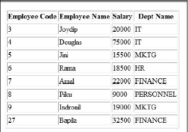
When you execute the application, the output is as follows:

Also read
With ASP.NET 2.0, Microsoft introduces a new feature known as validation groups,
which enables you to create different groups of validation controls and assign
them to input controls, such as text boxes. You can assign a validation group
to a collection of input controls if you want to validate the collection of
input controls on the same criteria............
One of the neat features of ASP.NET 2.0 is themes, which enable you to define
the appearance of a set of controls once and apply the appearance to your
entire web application............
ASP.NET 2.0 ships with a Web Parts Framework that provides the infrastructure
and the building blocks required for creating modular web pages that can be
easily customized by the users. You can use Web Parts to create portal pages
that aggregate different types of content, such as static text, links, and
content that can change at runtime..................
Visual Studio 2005 is the best development tool for building data-driven web
applications. As part of the Visual Studio 2005 suite of tools, Microsoft is
introducing a new tool called Visual Web Developer (VWD) that is designed to
work with the current and next generation of ASP.NET. VWD provides powerful new
features for the web developer.................
ASP.NET can also impersonate a specific account you specify in
web.config.........
The passing of the control from the child to the parent is called as
bubbling..........
ASP.NET runs inside the process of IIS due to which there are two authentication
layers which exist in the system.............
|