|
An Introduction to Expression Blend and XAML
If you believe that Expression Blend is an application best suited for a role
like an XA, then you also understand and appreciate that its goals are to allow
the rapid creation of user interfaces (UI’s). Perhaps the area that you may
have heard about is XAML.
Expression Blend is itself written with XAML and WPF application development
technologies such as Cider extensions for Visual Studio. Although there are
marked improvements on the performance of the Blend application compared to the
very first preview versions, the overall concept is starting to be accepted by
the wider development/designer communities as a whole. They understand that
performance will improve as the technology matures, which has been proven now
with the release of Visual Studio 2008 and the .NET Framework 3.5, both
improving the ability to develop for the platform.
|

By: Brennon Williams
|
Reproduced from the book
Microsoft Expression Blend Unleashed
. Copyrightã 2008, Pearson Education, Inc., 800 East 96th Street, Indianapolis,
IN 46240.
|
You will find out pretty soon, if you like working with XAML. The Blend design
interface may take a little longer to get into, simply because it is a
different tool with a similar ideology as other timeframe-based design
environments (or so it may appear).
When I began using the Expression Interactive Designer Community Technology
Previews, I was excited at first. This was finally justifying everything I had
been saying to development managers and others who couldn’t grasp the
importance of a great user interface—and more importantly, a great user
experience—for years.
When I had been using it for a few days, I got angry with certain elements of
it. It just wasn’t working like Adobe Flash does. I couldn’t understand why
designers would want to use it, considering the complexities it would bring to
their lives and how their confusion with .NET code and the application features
would eventually turn into hostility toward the lowly developer who just wanted
to provide the data for a list box and not have to worry about how it looked.
It all came together for me a few days later (well at about three in the
morning actually) during one of those rare moments of absolute clarity.
|
|
The combination of (Designer, Blend, and Visual Studio) is not about how a
control looks, it’s about how collections of visual and logical assets look,
function, and ultimately perform as a singular unit to provide the overall user
experience. Blend is not just for designers (or dare I say developers), but it
is the head of a toolset aimed at bringing both parties together with a
technology that can facilitate stunning designs with awesome .NET application
performance.
I can’t reiterate enough how important the glue—XAML—is! Graphic designers
indirectly use it to make visual assets; interactive designers mold it with
Blend; and together they create UIElements that integrate and use specific
functionality that adds to an overall visual perception. Developers can use it
to implement the designed functionality with additional feature sets.
An example of how XAML allows applications to be created better is when a
designer produces a storyboard that shows a gorgeous list box that has glass
highlights and rounded borders. The next storyboard shows that when a user
clicks on an item in the list box, the selected item flies across the screen.
There are very few instances where a conventional WINForms developer would take
the time to try and produce this result as per the storyboards in a WINForms
environment. But, by working together as a team, the XA makes this entirely
possible with Blend and Visual Studio, using the XAML visual assets created by
graphic designers. It is also extremely quick to build applications compared to
the development time on other existing platforms. The following equation says
it all:
(developer + designer) / time = speed = pub2
The remainder of this chapter is an overview of XAML, complete with explanations
of some primary levels of the XAML structures, how they relate to each other,
and how it relates to code classes produced in .NET. In Chapter 4, “XAML for
Beginners,” you will study XAML in a far greater depth.
Before you look at some XAML, there is another issue that struck me when using
Blend in the early stages. There is no Source Safe integration. Enterprise
developers instantly shy away from products that don’t have such integration.
But then again, it could make you think a little more about the architecture.
In a strict sense, your development environment should always contain some sort
of source protection system. That is when the use of multiple client-side
application layers came to me. By using this architecture, you can still
implement a source protection system that will not affect the UI development.
Layered Understanding
From now on, when you think about the front end of your application, you need to
think about layered development, similar to multi-tier or N-Tier development in
which you have specific application layers that perform specific tasks for the
entire application to function and perform in the manner in which it was
designed. Think about your front end having, at the very least, two layers
which I describe in detail for clarity.
The Graphical UI Layer
As the name suggests, this layer is where your user interface objects function
within their own scope. You, as the XA, now take XAML markup provided by a
designer or the design team and make it into a button or other required object
in Blend. Previously, if you wanted this button control to have a rollover
effect when the mouse moved over it, you would need to provide all the
programming that not only created the button in the first place, but also the
code to animate it or make it interact with other objects.
The designer creates the visual asset in a design tool like Expression Design
that exports XAML. You, as the XA, put all the pieces together; in fact, as you
will see, XAML is merely a representation of a .NET code class. As such, it has
the power to set properties and apply resources and data binding to-from
objects, UIElements, plus much, much more. Putting the design XAML together
with the functional XAML is simple.
Let’s say, for example, you have made a simple calculator application. When the
user clicks the = button on your form, the buttons click handler method goes
about taking the inputted values from other controls and or members in the form
and then displays the output directly on a textbox control. There is nothing
wrong with this; but to get my point across, now we are not going to provide
this method of application logic to your simple calculator application.
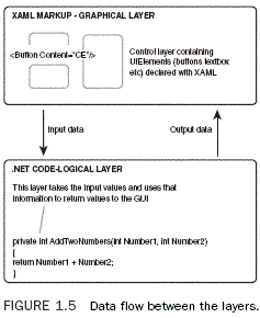
In your new Blend applications, you or your developer team would go off and
write a logic layer that receives inputs and provides outputs back to your
graphical layer (see Figure 1.5).

The Logic Layer (Class Library)
This layer is where developers author the code to interact and sometimes control
the UIElements that will appear in the scenes, by way of events and property
change notification. So, to continue with the previous example of a simple
calculator, the logic layer (I prefer engine or wrapper) provides public
methods with which each click of a button simply adds numbers and symbols for
the underlying engine to deal with. The UI layer is free to carry on with any
animations or UI-derived actions without the sequential hassles of also trying
to deal with the application logic.
Now when the user clicks the = button, the engine is called by the UI graphics
layer and goes to work with all the various inputs it has received. It then
fires a result out through an event or property change notification where the
graphics layer (which has subscribed to this event and or notification) then
does what it needs to do in order to display the result.
You may choose to have the graphical assets flash red or go semi-transparent,
who knows? The point is that the two layers remain completely separated, which
allows developers to easily add unit testing with NUint or a similar tool, as
well as gives you a complete set of functionality that will be the same
regardless of the front end UI or OS on which you are running the code. The
biggest advantage to this method, it has to be said, is from the developer’s
point of view. When they need to fix bugs or make maintenance changes, they
only need to make them to a single code library before testing and
redistributing the application. The advantage from the designer’s point of view
is that they may change the XAML style template applied to the buttons to give
them a different look, but the user experience is maintained by you, the XA,
controlling the collaboration between the developer and designer in Blend.
XAML Representations
So what exactly is XAML? People may be confused to learn that XAML does not
contain objects, shapes, UIElements, animations, or transforms for that matter.
XAML is simply an instruction set, and definitely not a programming language.
When these instructions are parsed to the WPF presentation engine, they are then
converted to an object tree in memory. So you can think of XAML as being a type
of serialization format for WPF, taking all the settings that you specify and
then producing your application as the result.
Assuming that you understand the concept of XML formatting and you also grasp
the concept that XAML is an XML representation of .NET code objects, take a
minute to let the following settle into your mind.
.NET classes are represented in XAML as tags. For example:
<MyClass></MyClass>
Object children and or complex properties are represented by nested elements.
For example:
<MyClass>
<MyClass.Child> Additional Children</MyClass.Child>
</MyClass>
Attributes are properties or event handlers, for example:
<MyClass Property=”100” Click=”Click_Event”>
<Child> Value</Child>
</MyClass>
|